ANNABELLE
|
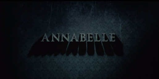
We think the Annabelle trailer titles are successful because they resemble the way that Annabelle moves and acs throughout the trailer. For example in this title shown on the left, the shadow underneath the text slowly moves and grows to the side throughout the shot. This relates to the idea of Annabelle being a mysterious spirit that is unknown to be lurking in the shadows, slowly beginning to make her appearance.
|
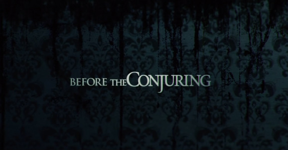
This is one of the first titles to appear in the trailer, this shows the audience that it is a sequel from the Conjuring therefore if they enjoyed this film then they will be more eager to watch Annabelle because of the good reception the Conjuring had when it was released.
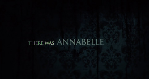
When the titles are appearing on the screen, a fade in and fade out effect is used to keep the idea of shadows appearing and disappearing, just like the character Annabelle. |
|
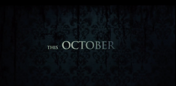
This title worked very well in the trailer because of linking to the title before but also each title focusses on a key word (e.g. ANNABELLE, CONJURING), this allows the audience to recognise the main characters, films or possibly the date the film is released (released in October as shown below).
Capital letters was used throughout the titles to make them more powerful to read and stand out, also the font used in the titles offers the audience a more believable and trustworthy mindset because of it being simple and straight to the point. |
|
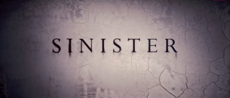
SINISTER |
This title is very important for the audience to see because it is giving information on when the film will be released so needs to be shown in the trailer clearly. I like the way they set this title out the same way as the others because it carries on the effect of the trailer staying dark and mysterious. Also each title has the same background using black and dark blue patterned wallpaper, i think this is because Annabelle is set in a old fashioned house therefore the wallpaper shows decoration to a house from a family that live there.
|
|
We think the Sinister trailer titles are successful because of the bold printed font in the centre of the screen with a lighter background. The white, cracked wall in the background could resemble the unstableness of the currently possessed house. Also the main title looks like it is being flashed from a torch which could resemble the darkness throughout the trailer and possibly trying to find out what is in the dark.
|
|
|
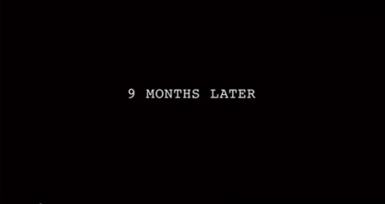
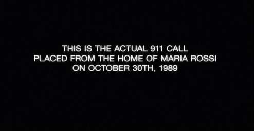
This title is much different compared to the others because of the size of the front but also the background being plain black. I think this is because it is trying to get the audience to think it is telling facts on when it happened which contrasts from being just horror to 'real life facts'.
|
|
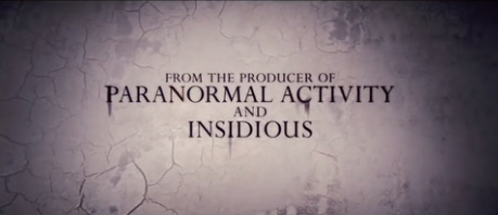
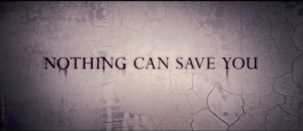
This title is very important for the trailer over all because of telling the audience it is a sequel from Paranormal Activity and Insidious. Because of these two horror films being very successful, shows the audience that Sinister will be just as good or even better. This then gives the film a good repuation already without the audience watching it.
|
|
THE DEVIL INSIDE |
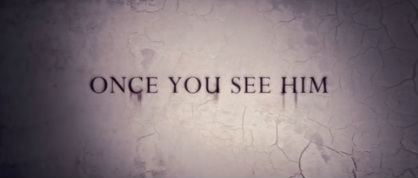
These two titles work very well together because of how they link to one another. It is also well thought out splitting it up into two because titles usually last for about 2-3 seconds therefore need to be short and to the point.
Having titles like these also make the audience want to know what will be said or shown next in the trailer because of the titles not giving too much information away. Also each title fades in and out of the screen to keep the mysterious effect and make the audience more involved in the trailer because of their fear and anxiety. |
|
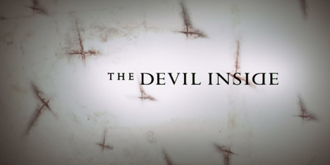
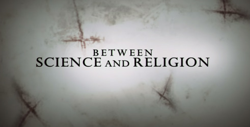
We think The Devil Inside trailer titles are very successful because of the background. I the dirty white background looks like a hospital gown which could resemble people needing help and are very ill or injured but also the dark brown/red marks scattered across the screen look like crosses which could resemble religion, religion has a big part in a film/ trailer when its involving devils therefore that is why I think they have used this background.
Lastly in the text itself, a backwards D is used, i think this is because of separating the film's name from the rest of the titles. But also it could be used simply for the audience to recognise the backwards D and instantly think of this film. |
|
|
This title contrasts with the other titles used which is very smart because the simple title with white titles and black background looks very trustworthy and gives the audience the impression the titles are stating facts. This is a good way to open up a trailer because it allows the audience to be more involved and believe the story of the trailers.
|
|
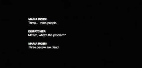
I personally like the way this title is laid out because of the conversation that is happening on the screen, it makes it look realistic and makes the audience feel like it is actually happening. The fact that this title is simple and plain is to make the audience feel like it is not a horror film they are watching but a documentary.
|
|
By Georgina Matthews
|
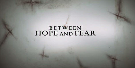
These two titles work very well together because of the way they link but also they do not give too much information to the audience so it makes them want to go and watch the actual film.
I also like the way both of the title's layout because the two lines make the title look more powerful compared to if only one line was used. Secondly in each title there are two main words the audience should focus on (e.g. Science, Religion), this explains why these words are much larger than the other words on the screen because the trailer will want the audience to pay more attention to the important keywords. |
