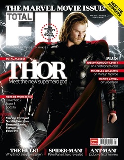
This magazine is very successful because firstly of the image. The image is the main Character Thor which attracts the female viewers and give the magazine a more sexy appeal. The light is shined on his face to emphasis his main good looking feature but also the hammer is lightened up, this shows the hammers and the characters powers.
The title links with the character very well because of the lightening attaching to his hammer since he is the god of thunder. The background is a dark colour which i think resembles outer space, this links very well with the character because he comes from a separate realm.
Lastly the title works very well because it can show the power from the lightening by how bright the title is appeared along with the text Thor. Overall I think this is the most successful magazine cover compared to the others because the background, character, titles and the layout all link together very well to resemble the film Thor.
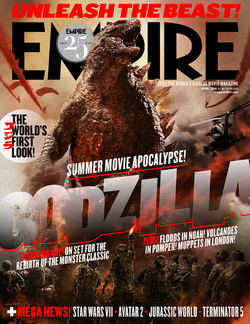
This front cover to a magazine is very eye catching due to a lot of colour and large text. The reason why i think large text is used is because of the fact Godzilla is a very large creature so i think the text resembles the size. Also a low angle shot is used in the image to emphasis the size of the creature to show power and dominance over the small images of the army of soldier at the bottom of the page.
The way the Godzilla is set out links very well with the story because the text is stacked like each letter resembles a building, the letters are very uneven which could resemble destruction of the city.
Lastly the most common colour used in this cover is red, red is a very bold and powerful colour that could mean danger from the war that is happening between Godzilla, but it could also mean death of either the creature of the many soldiers giving up their lives to try and protect the city.
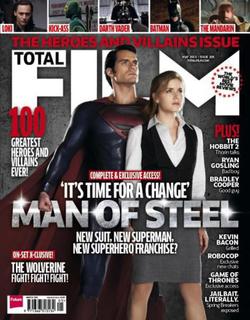
This magazine cover has a very futuristic effect to it because of the title and background, the title is presented like metal but the background looks like dark, hard concrete. These two materials could connect to the actual text Man Of Steel, steel is a very hard and strong metal therefore i think these two materials where used to emphasise his strength and power.
Also there is a female character stood in front of the male character to show the dominance he has compared to her. she looks in need for help with her facial expressions, but the male model has a very serious and stern face showing no fear.
Both characters has lit up faces to focus on their facial expressions, this is to make it obvious to the viewers that the two characters have two completely different mindsets.
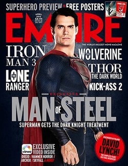
This magazine cover uses more large text compared to the others, I think it is because of the famous film names mentioned on this cover (e.g. Iron Man 3, Thor). Mentioning other very successful films on a magazine like this will enlarge the reputation of the the film being advertised because is gives off the impression that the film will be as good as the other films mentioned or even better.
The font used is very simple bus bold which attracts the attention to the main key words (e.g. MAN, STEEL). The colours used are simply white and grey which could resemble the the keyword steel and make the magazine have more of a metal effect.
The font used is very simple bus bold which attracts the attention to the main key words (e.g. MAN, STEEL). The colours used are simply white and grey which could resemble the the keyword steel and make the magazine have more of a metal effect.
By Georgina Matthews and Joe Pratt-Flynn
