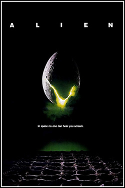
'Alien' is a classic example of a movie where they do not reveal the main antagonist until nearing the end. The producers of the poster brilliantly bring across the sense of mystery, with the pitch black background and the bold, plain white text evenly spaced across the top. Obviously, the main focus of the poster is the alien egg, with a crack near the bottom which reveals a light green aura surrounding the crack whilst releasing a green gas. This colour choice is very strange for a horror movie, but very common amongst the science-fiction genre. Then there is the slogan 'In space no one can hear you scream', which reflects upon the black background of the poster, emphasising the lonely atmosphere given off by the movie itself.
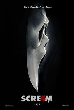
The scream 4 movie poster is very effective as it puts across a lot but only using a little. The poster is very minimalistic and only contains one image which has been manipulated to show multiple things. Underneath the scream make a knife has been included in order not to change the masks shape too much but also make it present in the image. In addition to this the overwhelming dark space around the image gives the viewer a sense of uncertainty as they are restricted from seeing its surroundings. This is effective as horror is mainly about keeping your audience from knowing what is going on and only giving them a clear picture of what is happening at the end. Using this in the poster will lure them wanting to watch the film. Also "4" in scream is hidden as the "A" but made present by making it blood red. This is very effective as it smoothly encorporates the title in one word and the red instantly tells the viewer that it is a horror movie. The monochromic image helps make the red stand out more as it almost looks out of place and will catch the viewers attention. The slogan is written at the top and in a small type face so it will not overwhelm the image and keep the main focus on the image of the scream mask.
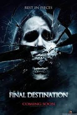
The Final Destination poster works in a very unique way due to the effects in the picture, by having 2 pictures the opposite (life and death) makes it obvious to the viewers that the movie is a horror, the sharp broken glass is used to separate the two pictures to allow them to contrast very well.The dark colours used works well with the pictures because of black representing evil but the lady who has a white wash over the face represents innocent. The main picture takes up most of the poster unlike the title, this is to allows the poster to be eye catching to the views since the large photo will be the first thing they will look at. Finally the poster uses a short but catching phrase `REST IN PIECES`, this links to the picture because of the glass being broken into pieces but also because of the death of possibly the girl in the picture. Overall this poster will be a very good structure to make a poster, simple but effective.
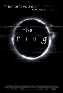
Again this poster uses a lot of black empty space to create the illusion of nothingness and loneliness. This dark empty space makes you feel alone and isolated which this film is about, being alone and knowing you cant go to anyone for help. This is also emphasised by the slogan "before you die, you see". It says you in order to target the viewer and make them feel involved with the film. The image presented is very mysterious as for somebody who hasn't seen or heard of the film it doesn't give them a good idea of what is going on. This is very effective as it should lure them in to watching it as they now crave to know what. The image is also slightly distorted, an effect that is commonly related to horror, this gives the audience a clear idea of the genre of the film.
