Question One
In what ways does your media product use, develop or change forms of conventions of real media products?
Using Conventions
Number One:
Having fast paced scenes is very common in trailers because of the build up to the climax, this creates tension and complements the title very well to make it dramatic and rememberable. It also allows the trailer to give more of the plot away but at the same time still leaving it as a mystery to make the audience want to watch the film.
Number Two:
The final impact/scare is very common in horror trailers, this usually happens right at the end of the trailer to to leave a lasting impression on the audience, this is the last thing they see so will judge the film on the most rememberable parts of the trailer.
Number Three:
Slow paced scenes open up most horror trailers, by doing this sets a more realistic environment introducing the characters so when the trailer begins to speed up and gain more tention the audience will react in a more scared way for feeling like it is a 'real story'.
Number Four:
Low key lighting is a key feature in horror trailers because by having darken scenes will make the audience feel more tense because of not knowing what will happen in the dark and also it restricts their vision so leaves them on the edge of their sets.
Number Five:
Mysterious and calming sound is usually used at the beginning of a horror trailer to set a more realistic atmosphere when introducing the characters and set. Possibly including what happened before e.g. family moving to a new house because of witnessing paranormal activities.
Number Six:
Many female actors were used within the trailer as the victims, this is very common in horror films because it relates to the idea of pain reflected on females create more of a sex appeal than males. Also the idea of males causing the pain on the females allows them to look more dominant and makes the females look more vulnerable and an easy target.
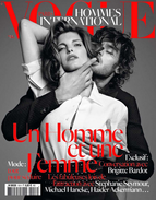
Our Poster
|
For our poster we used a typical black background to allow the audience to automatically know it is related to a horror story. We also made the two main characters on the poster (the killer and a female victim) two silhouettes due to not wanting to give too much information about the characters way but also to still keep the idea of the audience not knowing who the killer is.
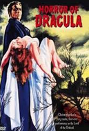
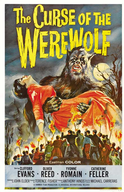
When deciding the position, we wanted the characters in for the poster we researched many different poster ideas from past horror films. We liked the thought of the killer holding a female victim to show the power of the male character, but also the idea of the victim and killer touching each other very closing in this position relates back to the theorist Kaminsky that stated killings are more personal when using knives and other objects for killing up close. |
|
Our Magazine
|
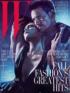
|
|
For our magazine we used two main characters we thought would sell the magazine, the reason why is because of a good looking male character with large muscles attracts the attention from the female audience but also using a typical blonde female character known as the victim makes the male audience attracted. Like our poser, we wanted the killer and victim to be close to one another with a dark background but at the same time allowing the faces of the characters to be shown so they could sell the magazine.
We deciding the position for the characters we researched many different magazine covers and how they sell the magazines using the 'sex appeal'. After looking at different magazine covers we realised the best way to sell a magazine cover is through a 'sex appeal' of two good looking characters showing sexual tention between them both. |
